|
|
Garamond
meets
the
Mona
Lisa
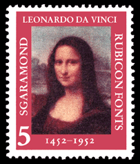 1952 marked the
500th anniversary of the birth of Leonardo da Vinci, painter of the
Mona Lisa. The lettering above is set in the SGaramond, which is
based on the typefaces of Claude Garamond from the 1540s.
References Wikipedia: |
The font categories listed below consist of fonts with similar properties. This helps users choose fonts that are suitable for their projects. Realist Fonts. Sans serif fonts with little variation in stroke width, and uppercase letters of nearly equal character widths. Also known as Neo-Grotesque. They have a neutral look. Humanist Fonts. Sans serif fonts with contrasting stroke widths, and uppercase letters of variable widths, based on the letters inscribed on Trajan's Column. They have a calligraphic look. Geometric Fonts. Sans serif fonts whose letters are based upon geometric shapes. They have a modern look. Book Fonts. Serif fonts designed for printing books or long passages of text on good quality paper. They have a low x-height and long ascenders and descenders. They are designed to be printed at sizes of 9 to 12 points with normal line spacing. They have a classical look. Newspaper Fonts. Serif fonts designed for printing columns of text in newspapers under poor print conditions. They have a tall x-height and short ascenders and descenders. They are designed to be printed at sizes of about 8.5 points, with tight line spacing. They have a common look. Packaging Fonts. Variants of other fonts, with an increased x-height. Can be serif or sans serif. Legible in smaller sizes, especially in product packaging. They have a commercial look. Condensed Fonts. Fonts with relatively narrow characters. The characters retain the same heights and stroke weights as regular width characters. Condensed type is used to fit more text into a restricted area without losing legibility. The main application is for tabular composition including tables, forms, lists, and directories. Electronic documents have strict font requirements Electronic documents for on-screen viewing have stricter font requirements than printed documents, because computer screens have lower resolution than printers. Some fonts that print well display poorly on-screen, especially in small sizes. The font properties and values you should look for in choosing fonts for electronic documents are as follows: Weight. The best weight to use is Medium, and you should generally use Normal, Medium, Demibold, or Bold. Fonts that are lighter than Normal tend to fragment, and fonts that are heavier than Bold tend to have the loops fill in. Light or Extrabold fonts can be effective, but use them sparingly, and in slightly larger sizes. You must be very careful of Light or Extrabold weights if your font is condensed. Italics. Italic or Oblique fonts do not rasterize well on-screen. The problem is that slanted lines look jagged and the weight tends to be thinner than normal. However, Italics are good for emphasis, and many fonts have beautiful Italics. Use Italics sparingly, and in slightly larger sizes. Bold Italics are less problematic than normal Italics. X-Height. Choose fonts with relatively large x-heights. This includes Newspaper and Packaging fonts. An increased x-height ensures the font is legible in smaller sizes, especially 8, 8-1/2, or 9 points. However, fonts with increased x-heights make the text feel crowded, so increase the spacing between lines. If you have lots of vertical space on your pages, you can use fonts with a normal x-height, such as Book fonts, but use them in a larger size, in the 10 to 12 point range. Loops. For small point sizes, say less than 9 points, choose a font with relatively large loops, for example a Newspaper font. Otherwise, the loops tend to fill in. Size. If you have the available space, use 12-point type and choose a font with a normal x-height. However, this is rarely the case. Book fonts should be used at 10 points or larger. Realist or Humanist fonts should be used at 9 points or larger. Newspaper or Packaging fonts should be used at 8 points or larger. Many fonts do not look good at very large sizes. Consider a condensed or compressed font variant for large sizes. Width. The best width to use is Normal but you can sometimes use narrower fonts, such as Condensed, to fit more text into a restricted area. Here, weight comes into play also. Bold Condensed type is very useful for fitting titles or headlines onto a single line. Normal Condensed type should be reserved for individual words or phrases, as in a table. |
Looking
at
font
properties Fonts have visual and technical properties as follows: Serif. A part of a character which crosses the end of a major stroke. Sans Serif. Without serifs. X-Height. Height of the lowercase letter x, above the baseline. Ascender Height. Height of the lowercase ascenders, above the baseline. Cap Height. Height of the capital letters, above the baseline. Descender Depth. Depth of the lowercase descenders, below the baseline. Width. Refers to the overall width of the alphabet. Font widths can be Normal, Expanded, Narrow, Condensed, Compressed, etc. |
| Updated
Sept. 17,
2011 |