Font Samples, Demo Versions, Ordering
![]() Rubicon
Softfont Library
Rubicon
Softfont Library
Font Samples, Demo Versions, Ordering
 * Euro symbols included |
Font Packages
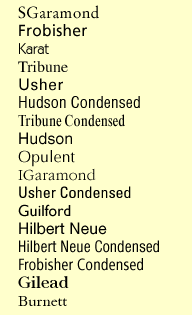
#1 SGaramond |
Description
Serif Text |
PDF Font Samples
Brief Specimens
Long Specimens
The Frog King
Alice In Wonderland
The Gambler
Peloponnesian War
The Telltale Heart
Financial Statement
Font Glossary
Punctuation Glossary
These font samples require Adobe Acrobat Reader to view online or offline.
| Purpose
Body Text |
Suggested Font
Serif Text |
Text Fonts are designed for use at 14 points or smaller.
Display Fonts are designed for use at 18 points or larger.
Advertising could be Text size or Display size.
Body Text is the main text in Book, Magazines, Newspapers, etc..
Lengthly text should use a serif font
Line width should accomodate 55 to 70 chars
Interline spacing should be 15% to 33% of the point size
Body text should be 8 to 12 points tall
For a given paper size, there aren't many reasonable combinations
of typeface, point size, line width, and leading. Extended passages
of text should use a serif font, 8 to 12 points tall. Books are usually
10 to 12 point, advertising 9 to 11 point, and newspapers 8 to 9
point. The choice of typeface and point size restricts the possibili-
ties for line width and leading. It is difficult to translate linear
measure into characters per line. This is done by experience
and by trial and error. Suitable leading depends on the typeface,
point size, and line width.
The line width restrictions can be relaxed under certain conditions.
55 to 70 characters per line is optimal. Less than 55 requires a
good hyphenator. At 40 or less the titles or headings start to
exceed the column width, long words cause formatting problems,
and in general some newspaper specific software is required. A
benefit of narrower columns is that they retain legibility with less
leading, which saves space. Some newspapers go as low as 28
characters per line.
Sample 1 uses Courier at 12 point on 14 point leading, with 64
characters per line. This is a monospaced typewriter font. Left
and right margins are 1-1/8" and line width is 6-1/4". Courier
was
designed for use at 12 points and the 14 point leading looks
spacious without being wasteful. 14-1/2 point would be OK also.
Generally, fonts like Courier should be used at 10 or 12 points, or
possibly 11. With a smaller point size the left and right margins
should be increased, to avoid too many characters per line.
Sample 2 uses SGaramond Roman at 10 point on 12 point leading,
with 61 characters per line. This is a serif book font. Two columns
are used. There are no feasible one column formats for this font and
page size. Left and right margins are 1/2", the column width is 3-5/8"
and the gutter is 1/4". The leading is acceptable but tight. 12-1/2
points would be better if space permits. The font is darker than
Normal, almost Medium. This increases legibility but is less handsome
than Normal. The line width is good for two column newsletters, or one
column books if the pages are shorter.
Sample 3 uses IGaramond Roman at 10 point on 12-1/2 point
leading, with 62 characters per line. This is a serif book font. Two
columns are used. There are no feasible one column formats for this
font and page size. Left and right margins are 1/2", the column width
is
3-5/8" and the gutter is 1/4". The leading is comfortable. The
font is
lighter than Normal, more handsome but less legible.The line width is
good for two column newsletters, or one column books if the pages are
shorter.
Sample 4 uses Gilead Roman at 8-1/2 point on 9-1/2 point with 32
characters per line. Gilead is a specially designed newspaper font with
shortened ascenders and descenders. This is a four column layout. The
left and right margins are 1/2", the column width is 1-3/4" and
the gutter
is 1/6". The font is almost Medium in weight with a tall x-height.
The
leading is not crowded. It could be reduced to 9 or 8-1/2 points (solid)
if
necessary, but 9-1/2 is better if space permits.
Sample 5 uses Gilead Roman at 8-1/2 point on 10 point with 43
characters per line. Gilead is a specially designed newspaper font with
shortened ascenders and descenders. This is a three column layout.
The left and right margins are 1/2", the column width is 2-3/8"
and the
gutter is 3/16". The font is almost Medium in weight with a tall x-height.
The leading is correct. Note that Sample 4 has a narrower column and
smaller leading but the legibility is about the same.
![]()